

Claude's new interactive visuals are wildly underrated
How to use Claude's interactive visuals to think faster, learn quicker, and present better.

Hey friends 👋
Welcome to another Signal Pro workflow issue.
Albert Einstein reportedly called compound interest “the eighth wonder of the world.”
He’s also one of the most misquoted figures in history, so take that with a pinch of salt.
Either way, whoever said it had a point. Compound interest is one of those concepts that everyone sort of understands. Money grows over time. The longer you leave it, the more you earn. Got it.
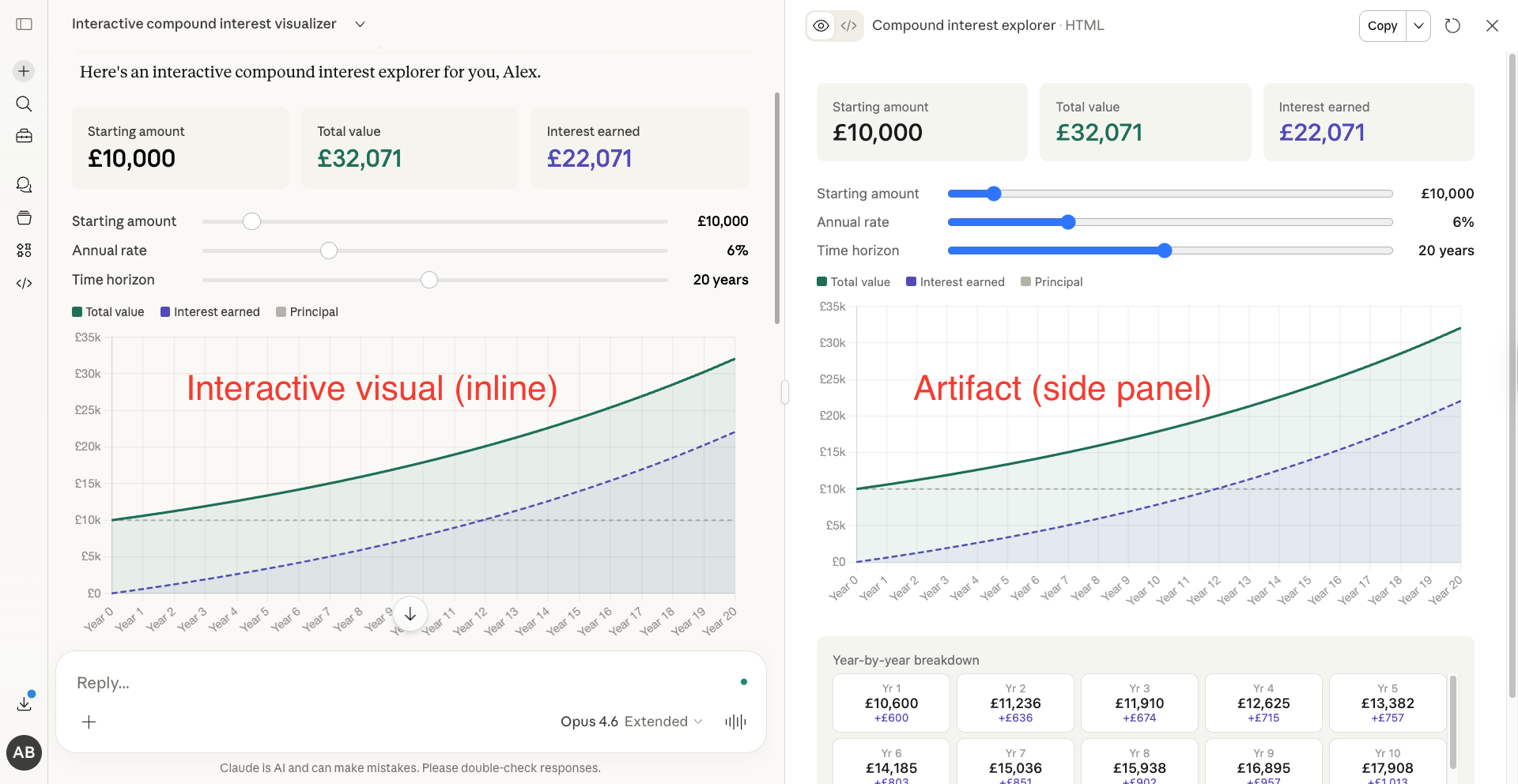
But last week, I typed this into Claude: “Show me a beautiful visualisation of how compound interest works. Let me adjust the rate, starting amount, and time horizon.”
Instead of the usual wall of text, Claude drew me an interactive chart. Something I could click, drag, and manipulate. This is the perfect example of “show, don’t tell”.
How was this possible?
Well, Anthropic quietly rolled out interactive visuals inside Claude on March 12th. The feature builds charts, diagrams, flowcharts, and even mini interactive tools directly inside the conversation. No side panel, separate app, or code required.
And it’s available to everyone, including free users.
Most of the coverage I’ve seen focuses on the novelty “look, Claude can draw now.” But the real value lies in what this means for how you think, learn, and communicate when you prompt it well.
Today I’ll show you:
What interactive visuals actually are (and how they differ from artifacts)
The examples that show the true range of this feature
How I use it in a business context with real data
My exact prompt templates for each visual type
A workflow for turning visuals into presentation-ready assets
What are interactive visuals?
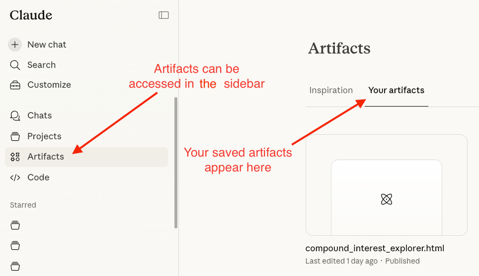
If you’ve used Claude before, you might have heard about artifacts. These are the documents, code files, and apps that appear in a side panel for you to download or share.
Interactive visuals are different. They’re built using HTML and SVG (the same building blocks as web pages), rendered inline in the conversation, and designed to be temporary.
Here’s the key distinction:
Artifacts = permanent, shareable, downloadable. They live in a side panel.
Interactive visuals = ephemeral, inline, manipulable. They live inside the conversation flow.
The visuals aren’t static images either. Claude builds them as interactive elements you can click through, hover for detail, drag sliders, and expand to full screen. When you ask a follow-up question, Claude can update or rebuild the visual on the fly.
The feature is on by default. Claude decides when a visual would help based on what you’re asking. But you can also trigger it directly with phrases like:
“Draw this as a diagram”
“Visualise how this changes over time”
“Chart this data for me”
“Show me a flowchart of this process”
“Build me an interactive model of X”
What you should know before we go further:
Available on web and desktop only (not mobile, not Cowork yet)
Works on all plan types including free
Opus produces the best results for complex visuals. If you’re on Pro, switch to Opus for anything ambitious
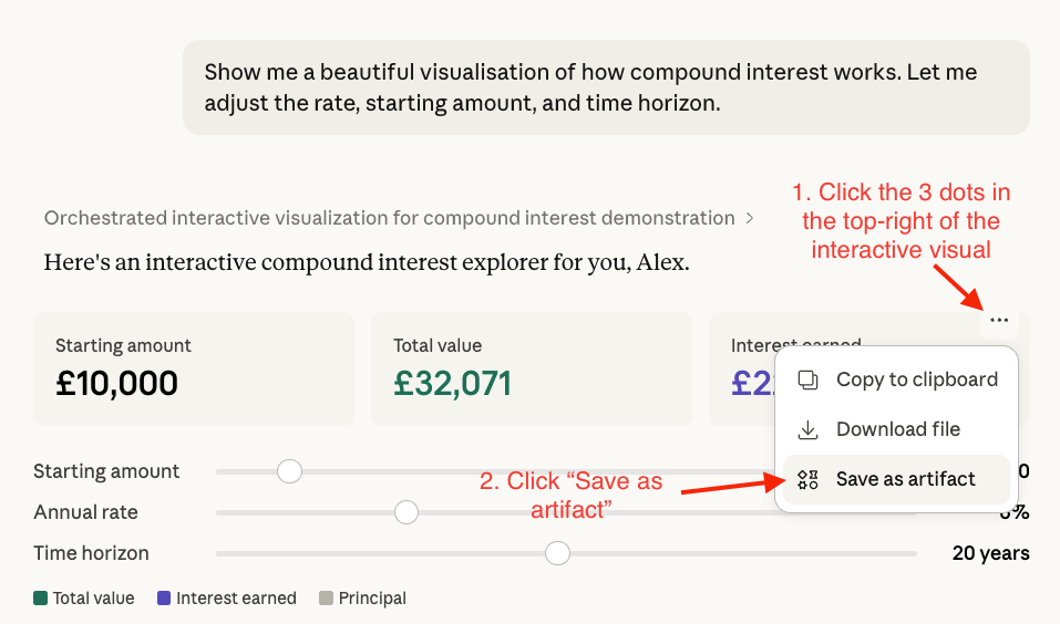
You can download them as .html files or save them as artifacts to publish and share
This feature has serious range
I’ve spent the past week testing this in every context I could think of and the results have genuinely surprised me. Let me show you exactly what I mean.
1. Explore career paths
This one was inspired by Anthropic’s own demo, and it’s a brilliant use case.
Type something like: “What’s a good career path for someone who enjoys sketching, visiting old buildings, and solving 3D puzzles? Map out careers with that vibe.”
Claude builds a visual career map. At the top, your three interests appear as colour-coded cards (Sketching (visual thinking), Old buildings (heritage + place), and 3D puzzles (spatial reasoning)) with lines converging to show where they overlap. Below that, Claude organises matching careers into three tiers: best-fit careers, strong matches, and worth exploring.
But here’s the bit that had the “wow factor”.
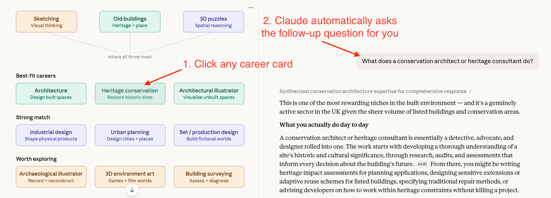
Each career card is clickable. When you click one, it automatically sends a follow-up prompt to Claude asking for a deep dive into that specific career. No typing required. I clicked “Heritage conservation”, and Claude immediately fired off: “What does a conservation architect or heritage consultant do?”
It then searched the web and came back with a full breakdown. What you’d actually do day to day, where you’d work, how to get there (specific qualifications), what it pays (with real salary ranges), and why it suits your specific interest profile.
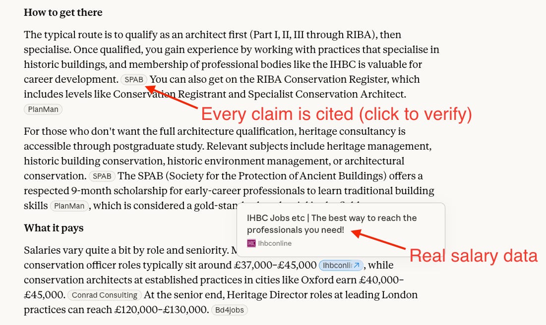
All cited from real sources (not hallucinated), giving you confidence in the data presented.
📝 Pro tip: Next time you’re mentoring someone (or rethinking your own direction), try describing interests rather than job titles and let Claude map the landscape visually. Then click to go deeper on whatever catches your eye.
2. Understand physics (or anything visual) in seconds
Ask Claude: “Show me Newton’s three laws of motion with interactive demonstrations.”
Claude builds three separate interactive demos. The first law gives you a puck you can launch across a surface. Toggle a friction checkbox on and off to see inertia in action. The second law gives you a block with Force and Mass sliders. The third law gives you a cannon. Hit "Fire!" and the cannonball launches forward while the cannon recoils backwards (this was my favourite).
My inner child immediately lit up when I saw these visualisations. I honestly wish I had this back in school. Whilst textbooks expect you to internalise it from a formula, this lets you play with it and goes way beyond what any static page can do, especially with the opportunity for limitless iteration to cement your understanding.
📝 Pro tip: This works for any concept you've been nodding along to without fully understanding. Try: "Show me [concept] visually. Assume I have no prior knowledge."
3. Learn any new topic faster
This is where the feature shines for professional development. You use AI tools every day. But could you actually explain how they work under the hood?
Try this: “Build me an interactive visual that explains how large language models work. Start with the big picture and let me click into each component for more detail.”
Claude built me a layered explainer with five clickable stages. At the top level, each stage is a card with a one-line summary. Click any card, and it expands into an interactive deep dive.
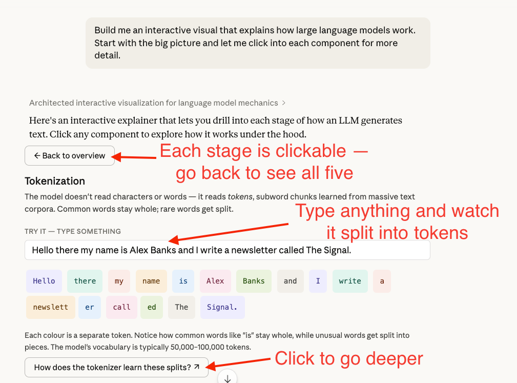
The “Tokenization” stage has a “Try it” input field. I typed “Hello there my name is Alex Banks and I write a newsletter called The Signal” and watched Claude split it into colour-coded tokens in real time. Common words like “Hello” stayed whole, but “newsletter” was split into “newslett” and “er”, and “called” became “call” and “ed”. You can see why AI sometimes does weird things with uncommon words.
Every stage also has a blue follow-up link at the bottom (e.g., “How does the tokenizer learn these splits?”) that auto-sends a deeper question to Claude. You could spend 5 minutes on this or 45. The depth is up to you.
📝 Pro tip: Use this the day before a meeting where you need to sound informed. The layered visual means you can go as shallow or deep as you need.
The prompts that actually work
Those examples show the range. But the real value for most of you will be in the day-to-day. Turning messy processes into clear flowcharts and making data visual in seconds.
The difference between a forgettable interactive visual and one your colleagues would actually share comes down to how you prompt it.
Here are the prompt templates I use. Customise these to your role and you’ll immediately notice a difference in output quality.
Prompt template 1: Process diagrams
The default “draw me a flowchart” prompt gives you something basic. This template produces a structured, clickable diagram with real detail: